The Goal
The Aardvark is a (fictitious) micro-blogging social media which has casual and fun vibe targeting communicative young people, and they have decided to develop a responsive website. The goal of this is to create responsive desktop, tablet, and mobile site where their users could easily access to information of interest and have fun interactive experiences.
Responsive Design with Grids
• 1440 x 900 px for desktop
• 768 x 1024 px for tablet
• 375 x 667 px for phone
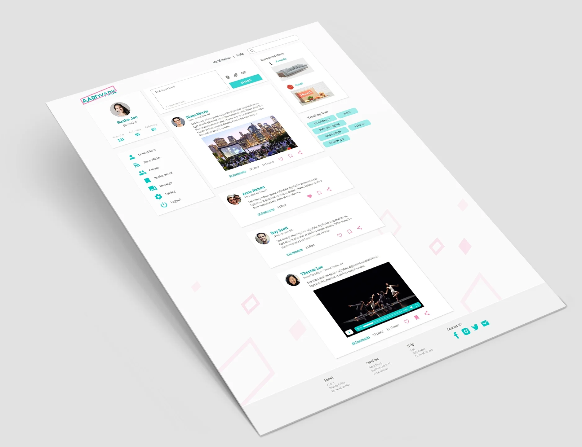
To adapts a design to whichever device a user is using, I created a responsive wireframe design for The Aardvark homepage. Those are based on the visual hierarchy and grid system that I’ve made earlier in the design process, to provide clear reading, writing and sharing experience for the user.
UI Design
• Brand Mood Board
• Style Tile
• Icons
• Design Spec
Based on their major part of users(communicative young people) and brand identity, my keywords for the design were vivid, joyful, eccentric, bright, fun and young. Roboto Slab and Source Sans fonts were chosen for rhythmical vibe and legibility. A bright eccentric palette of yellow, pink, teal and blue was chosen to deliver joyful mood to the users.